I teach a kids photography class (ages 11-15), and this week we started talking about composition. I don’t require a specific type or level of camera, so I have students shooting with DSLRs, as well as students with simple point-&-shoot models. Because of the wide range of cameras, I make this class a little less about the technical and a little more about how they see the world around them. I strive to make sure they understand the elements of exposure, the principles of lighting, and all of the other aspects of the craft that come into play when they push the button and capture a moment in time. Regardless of make and model, though, the one thing they all share is a viewfinder– a frame in which to compose and arrange those moments in time. The way that each of these young photographers grasps the concepts and applies them to their own world view is incredibly enlightening and fun to watch.
So, in class this week I explained that composition guides the viewer through the frame and answers the question, “What are you trying to say?” Put another way– “This is why I stopped and took this photo.” Now that they are armed with another set of photographic fundamentals, I’m giving them a week or two to get comfortable with photographing the same subject different ways before giving them one of my favorite assignments of the semester– “A Frame Within a Frame.”
If the frame is your window on the world, composition is where you point it. The FWAF exercise basically pushes them to find boundaries within boundaries. On the one hand, that sounds pretty restrictive, and I suppose it can be. The flip-side, however, is that pushing them to compose within certain confines now will help unleash vast waves of creativity later. I tell them every chance I get that the rules of photography were made to be broken, but first they have to know what they are. Speaking of rules, the FWAF challenge has only one– no actual frames. That’s right– no posing your subject in the middle of a wheat field, along the railroad tracks, or any other overly cliche setting, while holding a big empty frame in front of them. I try, whenever possible, to shoot the assignments I give my students, and just about all of the images in this article were part of Frame Within a Frame exercises.
One of my favorite FWAF shots was one of those happy accidents where you don’t even realize what you’ve got until it’s off the camera and up on a bigger screen. I knew that mama lion had been pretty close, keeping a watchful eye over one of her growing cubs, but it wasn’t until I’d downloaded the images that I realized that I’d caught her attentive gaze perfectly framed between Junior’s two front legs.
See where I’m going with this? No literal frames were harmed in the creation of these photos. Anything that creates additional boundaries within the images effectively creates an additional frame, which then directs the viewer’s attention much more precisely where you want it to go.
This next image is a great example, not only of a frame within a frame, but of repetition as an interesting compositional element. A tighter crop of the artist at work would have been okay, I guess. We’d be able to make certain assumptions about what’s not in the photo– namely, the subject of her piece. By including it in my background, however, I not only created the additional frame, but also lead the viewer through the image from right to left, taking in the artist, her canvas, and her inspiration.
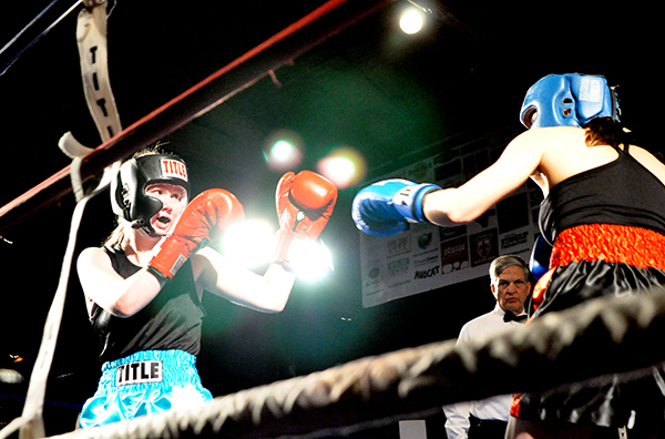
Once you get in the habit of looking for these extra frames you’ll start noticing them in all sorts of places. These boxers, for instance, are framed perfectly within the ropes of the ring. As a compositional tool, the added frame not only directs the viewer’s attention, but it also helps to minimize any distracting or non-essential elements from the photo.
Obviously, the frame within a frame is much more interpretive than literal. Doorways, windows, and mirrors– elements with clearly defined lines– can create great effects, but I enjoy seeing what my students do with the assignment when they are comfortable enough to ignore the obvious and go for something much more organic.
One of my favorite photography quotes comes from National Geographic photographer Jim Richardson, who says that “If you want to be a better photographer, stand in front of more interesting stuff.” One of the things that fascinates me about composition and exercises like this is how we push ourselves to not only stand in front of more interesting stuff, but to also photograph more interesting stuff in a more interesting way.


